

UX and UI Case Study:
Client: Bethany Outreach Baptist Church
Website: bethanyoutreachbc.com
The Ask: Bethany Outreach Baptist Church, a congregation based in Jamestown, NC, embarked on a significant new venture: developing their very first website. Until now, the church had operated without any online presence, relying solely on in-person interactions, printed materials, and word-of-mouth to communicate with its congregation and the broader community. The leadership recognized the need to embrace technology and create a digital platform that would provide a welcoming, user-friendly experience for both current members and potential new visitors.
The development this website was a critical step in modernizing Bethany Outreach Baptist Church's communication strategies, providing a central online space that reflects the church’s values and mission. This case study explores the research, design, and development process undertaken to build a digital presence that would serve the church community effectively, ensuring that the new website meets the needs of its users and supports the church's growth in the digital age.
Why the Website Development Was Needed: The decision to develop a website for the first time was driven by several key factors:
No Previous Online Presence: Bethany Outreach Baptist Church had never had a website. As a result, they lacked an essential digital platform for communicating with their congregation and engaging with the community online.
Embracing Online Opportunities: The leadership saw the potential of an online presence to enhance their outreach efforts, making it easier for people to connect with the church, learn about its mission, and participate in its activities.
User-Friendly Navigation: With many church members using smartphones and other digital devices, it was crucial to develop a website that offered easy navigation, ensuring that users could quickly find the information they needed, whether it was service times, event details, or sermons.
Facilitating Tithes and Donations: The church wanted to introduce an easy and secure way for members to give tithes and donations online, making it more convenient for those who preferred digital transactions.
Improving Information Sharing: With no previous digital platform, the church struggled to share information about upcoming events, conferences, and other activities. The new website would serve as a central hub for all communications, making it easier for members to stay informed and engaged.
Initial Research: User Surveys
Initial Research: User Surveys
To understand the needs and preferences of Bethany Outreach Baptist Church's members and visitors, I designed a user survey that covered several key areas. The survey questions were crafted to reveal insights into their digital behaviors, expectations for a church website, and any challenges they encountered with the previous site. Here's an overview of the questions asked:
1. Device Usage:
Question: What device do you primarily use to access the church website?
Options: Desktop/Laptop, Tablet, Mobile Phone
Follow-up: How often do you use this device to visit the church website?
2. Purpose of Visit:
Question: What is the primary reason you visit the church website?
Options: Find service times, Access online sermons, Check for upcoming events, Make donations, Contact the church, Other (please specify)
3. Ease of Use:
Question: How easy is it for you to find the information you're looking for on the church website?
Options: Very easy, Easy, Neutral, Difficult, Very difficult
Follow-up: If difficult, what specific challenges do you face when navigating the site?
4. Design Preferences:
Question: How would you describe the current design of the church website?
Options: Modern and welcoming, Functional but outdated, Confusing, Other (please specify)
Follow-up: What aspects of the website design would you like to see improved?
5. Content Accessibility:
Question: How often do you access online sermons or other media on the church website?
Options: Frequently, Occasionally, Rarely, Never
Follow-up: Is the media content easy to access and view on your device?
6. Event Information:
Question: How important is it for you to have easy access to event information on the website?
Options: Very important, Important, Neutral, Not important
Follow-up: How well does the current website meet your expectations for event information?
7. Navigation:
Question: How would you rate the navigation system of the church website?
Options: Very intuitive, Intuitive, Neutral, Confusing, Very confusing
Follow-up: If confusing, what improvements would you suggest for the navigation system?
8. Engagement:
Question: How likely are you to engage with the church through online platforms (e.g., signing up for events, making donations)?
Options: Very likely, Likely, Neutral, Unlikely, Very unlikely
Follow-up: What features or functionalities would encourage you to engage more online?
9. Additional Feedback:
Question: What other features or content would you like to see on the church website?
Question: Are there any additional comments or suggestions you would like to share about your experience with the church website?
Key Findings:
Device Usage: 75% of respondents primarily used mobile devices to access the church website, highlighting the importance of a mobile-friendly design.
Ease of Use: Users expressed the need for a clear and intuitive navigation system, with several indicating that the previous site was somewhat difficult to navigate.
Design Preferences: The majority wanted a modern and welcoming design that better reflects the church’s values, with a focus on accessibility and user-friendliness.
Content Accessibility: Many users emphasized the importance of easily accessible event information, service times, and online sermons, suggesting these as top priorities for the new design.
These insights guided the subsequent design and development phases of the website, ensuring that the final product met the congregation's needs and expectations.
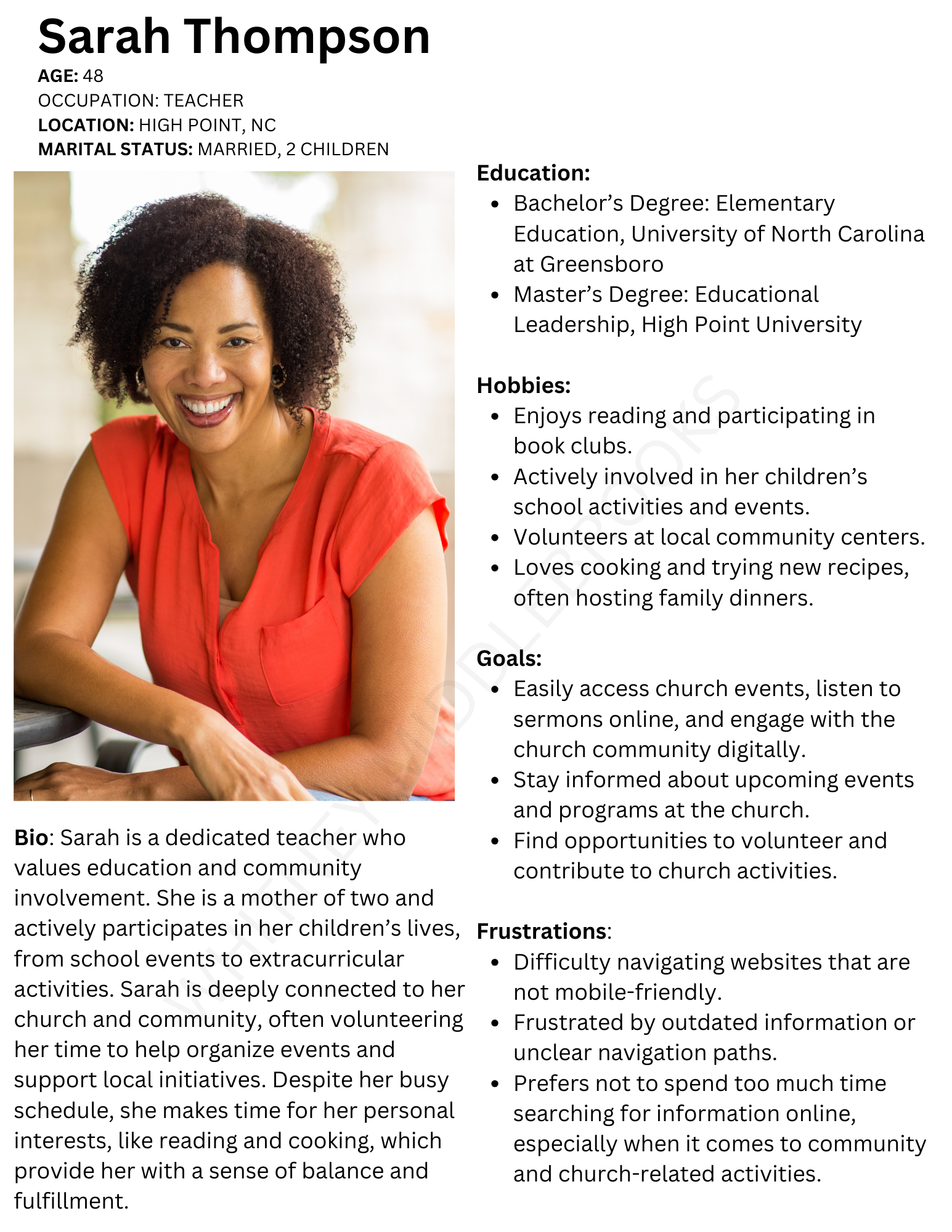
USER PERSONA
Based on the survey results, I developed a primary user persona to guide the design process. Meet Sarah!
Empathy Map Overview: Understanding Sarah Thompson
To gain a deeper understanding of Sarah Thompson, I developed an empathy map. This tool allowed me to explore not just her immediate frustrations, but also her underlying hopes, fears, abilities, limitations, reasoning, and goals. This comprehensive approach provided valuable insights into how the website can better serve her needs.
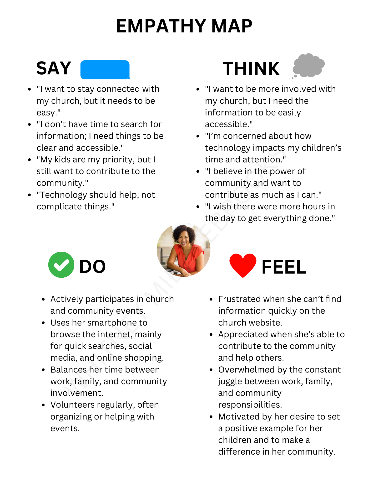
Empathy Map
1. What Does Sarah Say?
"I want to stay connected with my church, but it needs to be easy."
"I don't have time to search for information; I need things to be clear and accessible."
"My kids are my priority, but I still want to contribute to the community."
"Technology should help, not complicate things."
2. What Does Sarah Do?
Actively participates in church and community events.
Uses her smartphone to browse the internet, mainly for quick searches, social media, and online shopping.
Balances her time between work, family, and community involvement.
Volunteers regularly, often organizing or helping with events.
3. What Does Sarah Think?
“I want to be more involved with my church, but I need the information to be easily accessible.”
"I'm concerned about how technology impacts my children's time and attention."
"I believe in the power of community and want to contribute as much as I can."
"I wish there were more hours in the day to get everything done."
4. What Does Sarah Feel?
Frustrated when she can't find information quickly on the church website.
Appreciated when she’s able to contribute to the community and help others.
Overwhelmed by the constant juggle between work, family, and community responsibilities.
Motivated by her desire to set a positive example for her children and to make a difference in her community.
5. What Does Sarah See?
A world increasingly reliant on digital solutions, which can be both a help and a hindrance.
Other parents struggling to balance their time between work, family, and personal interests.
Church and community members looking for ways to stay connected and engaged, especially online.
A need for clear and accessible online resources that cater to both tech-savvy and less tech-savvy users.
6. What Does Sarah Hear?
From friends: "The church’s new website looks great, but I wish it were easier to navigate on my phone."
From her children: "Mom, can you help me with my homework? I can’t find the resources online."
From her colleagues: "Digital tools are great, but they need to be intuitive and easy to use."
From church leadership: "We want to make it easier for our congregation to access information and stay connected."
Empathy Map Insights:
Hopes: Sarah hopes to stay connected with her church community and contribute meaningfully, without sacrificing time with her family.
Fears: She fears that she won’t be able to keep up with the digital world, particularly in ways that impact her children’s well-being and her ability to stay engaged with her church.
Abilities: Sarah is moderately tech-savvy, but she values simplicity and ease of use in digital experiences.
Limitations: Time constraints due to balancing work, family, and community involvement; she has limited patience for complicated or non-intuitive digital tools.
Reasoning: Sarah is pragmatic and values efficiency. She believes that technology should enhance her life, not complicate it. Her decisions are driven by the need to balance her responsibilities effectively.
Goals: Sarah’s main goals are to stay informed about church events, engage with the community, and contribute to her church in meaningful ways, all while managing her family responsibilities.
Overview of Empathy Map: Creating an empathy map for Sarah Thompson provided me with a deeper understanding of her needs, beyond just her immediate frustrations with the website. This process highlighted the importance of a user-friendly, accessible, and mobile-optimized website that reflects the church’s mission while catering to the diverse needs of its members. By addressing Sarah’s hopes, fears, abilities, and limitations, I was able to create a website that not only meets her needs but also enhances her connection to the church community.
Task Flow and Defining the User Flow
Task Flow: I mapped out the key tasks users would perform on the site, such as finding service times, accessing sermons, and making donations.
Key Tasks:
Find service times.
Register for upcoming events.
Listen to or watch past sermons.
Make a donation.
Contact church leadership.
User Flow: I defined the user flow to ensure that these tasks could be completed with minimal clicks and confusion. The primary objective was to streamline the navigation to enhance usability, especially on mobile devices.
Wireframe Sketches: Before diving into the design, I created wireframe sketches to visualize the layout and structure of the site. These wireframes focused on:
Simplifying the navigation menu.
Highlighting key sections like sermons, events, and donations on the homepage.
Ensuring the design was responsive and mobile-friendly.
3. User Testing
Participants: Ministry Leadership & Church Members
Testing Process: I conducted user testing sessions with a diverse group from the church, including both tech-savvy and less tech-savvy individuals. The testing focused on:
Ease of navigation.
Accessibility of key information.
Overall design appeal.
Results:
Navigation: 85% of users were able to find the information they needed in under 3 clicks.
Design: Users praised the modern, yet inviting design, noting that it felt welcoming and representative of the church’s community.
Accessibility: Some users highlighted the need for larger text and clearer contrast in certain areas, which were promptly adjusted.
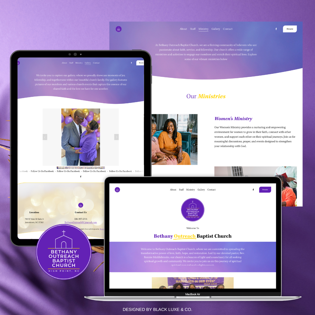
4. Final Mockups: Based on the feedback from user testing, I refined the design and created the final mockups. The website now features:
A clear, streamlined navigation menu.
Prominent sections for sermons, events, and donations.
A responsive design that looks great on both desktop and mobile devices.
Enhanced accessibility features, including adjustable text size and improved color contrast.
5. Next Steps: Once the website goes live, there are several key metrics I plan to track to continue improving and iterating on the current design and user experience:
Metrics to Track:
User Engagement: Monitor the number of visitors and their behavior on the site (e.g., time spent, pages visited).
Mobile Performance: Ensure the site is performing well on mobile devices by tracking load times and mobile-specific feedback.
User Feedback: Continuously collect feedback from users to identify any pain points or areas for improvement.
Conversion Rates: Track how many visitors complete key tasks (e.g., donations, event registrations).
Accessibility Compliance: Regularly check for any accessibility issues that may arise as content is added or updated.
6. Final Thoughts: Designing the Bethany Outreach Baptist Church website was a rewarding experience. The project not only allowed me to apply my UX/UI skills but also to create a digital space that truly reflects the church’s mission and values. The feedback from the congregation has been overwhelmingly positive, and I am committed to ongoing improvements to ensure the site continues to serve the needs of the church community effectively.
The website is now a central hub for Bethany Outreach Baptist Church, connecting members and visitors alike to the church’s vibrant community. Moving forward, I will continue to monitor and iterate on the design, ensuring it evolves with the needs of the congregation and remains a valuable resource for years to come.
Wireframe Overview:
For the design of the Bethany Outreach Baptist Church website, I followed a structured approach to develop the user interface and layout. The process was broken down into several key phases to ensure simplicity and usability:


Initial UI Sketches:
I began by sketching out the basic elements of the site. These rough sketches helped conceptualize the layout and positioning of major elements, including navigation menus, content blocks (for ministries, events, sermons), and key calls to action (such as donation links and contact forms).
Key sections included:
Home Page: With a welcoming message, sections for "Our Mission", "Music Ministry", "Community Service", and links to social icons.
Leadership Page: Dedicated to pastor and staff, focusing on simplicity with sections for social links and staff details.
Low-Fidelity Wireframes:
After fleshing out the UI sketches, I moved to creating low-fidelity wireframes. These wireframes were more structured and gave a clearer layout of the pages.
For each section:
The navigation bar included links such as “Home,” “About Us,” “Ministries,” “Events,” “Donate,” and “Contact.”
The homepage was organized into multiple content blocks to visually guide users to core areas like ministries, events, and the church's mission statement.
The layout of these wireframes emphasized clarity and ease of navigation, utilizing simple lines and boxes to define areas where text, images, and buttons would be placed.
Website Blueprint:
In its simplest form, the website is structured as follows:
Top Navigation: A bar for easy access to all main sections.
Header Section: A welcome message with a prominent image to give a personal and warm introduction to the church.
Main Content Sections: Areas for featured ministries, upcoming events, and the church’s mission are displayed prominently on the homepage.
Footer: A basic footer with contact details, social media links, and additional navigation options.
Overall, the goal was to maintain a clean and organized layout, making the site easy to navigate while highlighting the church's key ministries and services.